Design system
Component library creation

Design system
Component library creation
Summary
While Maersk design system (MDS) defines the core principles, foundations, and visual language for basic building block components, the Supply Chain Platform (SCP) required additional platform‑specific interaction components to support complex workflows and platform needs. The component library was created to support this whilst still ensuring consistency across all capabilities. The component library consists of SCP filter design, SCP apge header component, SCP info cards.
Problem
The Maersk design system provides foundational UI elements such as buttons, tabs, and input fields, but lacks guidance for more complex components like filters, detail cards, and customizable table panels. This gap leads to inconsistent design patterns, slower development, and fragmented user experiences across the platform.
Approach
Stakeholders from UX, engineering, and product owner team partnered from the start—aligning on requirements, validating feasibility, and ensuring consistency across experiences. Components were identified, designed, built, and refined iteratively, with usability validation and cross‑platform reviews.

Solution
A Supply Chain Platfrom Component Library was developed through a focused, collaborative approach to extend the Maersk Design System (MDS) with patterns and components tailored to the SCP. Each component delivered in the library is a platform-specific component, which includes shared guidelines, best practices, recommendations, Figma templates, and Storybook components accessible across all teams.
Page header guideline

Confluence page header guideline

Figma page header component
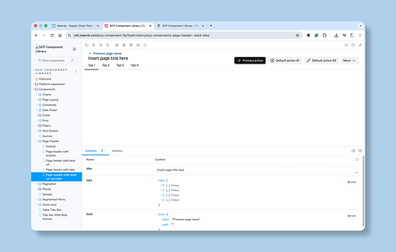
Storybook page header component
Filter guideline

Confluence filter guideline

Figma filter component

Storybook filter component
Impact
Creating the component library and guidelines improved design consistency across the platform, accelerated design and development workflows, and reduced duplication of effort. It enabled teams to scale more efficiently, ensured a more cohesive user experience, and provided a foundation for future product expansion.
-30%
Reduced UX work request by directing engineeering team to the component library without the need to create Figma for minor work requests.
Batch upload guideline

Confluence batch upload guideline

Figma batch upload guideline
Icons guideline

Filter guideline

Confluence rule builder guideline

Figma rule builder guideline
Interface guideline
